
Introduction
Mastering CSS Responsiveness 2025 – In today’s world, websites are accessed on various devices, from large desktop monitors to small mobile phones. A website that looks great on a laptop may look broken on a mobile screen if it’s not responsive. CSS responsiveness ensures that a website adapts to different screen sizes, providing a seamless user experience.

Why is CSS Responsiveness Important?
Imagine you’re visiting an online store to buy your favorite product. If the website looks good on your desktop but is messy on your mobile phone, you’ll probably leave and visit another site. This is why responsive design is crucial for businesses and websites to retain users and improve engagement.
Key Benefits of CSS Responsiveness:
- Better User Experience – A well-designed, responsive website improves readability and navigation.
- SEO Boost – Google ranks mobile-friendly sites higher in search results.
- Increased Conversions – If users find it easy to interact with your website on any device, they are more likely to complete actions like signing up or making a purchase.
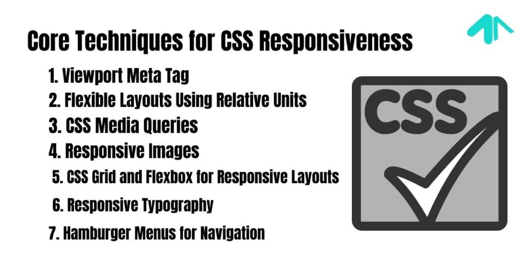
Core Techniques for CSS Responsiveness
1. Viewport Meta Tag
Before diving into CSS techniques, it’s important to add this line in the <head> section of your HTML:
<meta name="viewport" content="width=device-width, initial-scale=1.0">
This ensures the website scales correctly based on the device screen size.
2. Flexible Layouts Using Relative Units
Absolute Units (Not Responsive):
Using fixed pixel (px) values is not ideal because it does not adjust to different screens.
.container {
    width: 800px;  /* Not responsive */
}
Relative Units (Responsive):
Using em, rem, %, or vw and vh ensures the layout adapts to different screen sizes.
.container {
    width: 80%;  /* Adjusts based on screen width */
    max-width: 1200px;
}
| Unit | Description |
|---|---|
% | Relative to the parent element’s width |
em | Relative to the parent font size |
rem | Relative to the root element’s font size |
vw | Percentage of the viewport width |
vh | Percentage of the viewport height |
3. CSS Media Queries
Media queries allow you to apply different styles based on the screen size.
Example:
@media (max-width: 768px) {
    .container {
        width: 100%;
    }
    .nav-menu {
        display: none; /* Hide menu on small screens */
    }
}
| Screen Size | Media Query Example |
|---|---|
| Mobile (< 600px) | @media (max-width: 600px) |
| Tablet (600px – 1024px) | @media (min-width: 600px) and (max-width: 1024px) |
| Desktop (> 1024px) | @media (min-width: 1024px) |
4. Responsive Images
Using flexible image sizing ensures images adjust to different screens.
img {
    max-width: 100%;
    height: auto;
}
This prevents images from overflowing their container and keeps them proportionally scaled.
5. CSS Grid and Flexbox for Responsive Layouts
CSS Grid:
.grid-container {
    display: grid;
    grid-template-columns: repeat(auto-fit, minmax(200px, 1fr));
    gap: 20px;
}
This automatically adjusts columns based on available space.
Flexbox:
.flex-container {
    display: flex;
    flex-wrap: wrap;
    justify-content: space-between;
}
Flexbox makes elements adjust naturally as screen size changes.
6. Responsive Typography
Instead of fixed font sizes, use relative units.
body {
    font-size: 1rem; /* Adjusts based on root element */
}
For fluid typography, use CSS clamp():
h1 {
    font-size: clamp(1.5rem, 5vw, 3rem);
}
This means:
- The font size will never go below 1.5rem.
- It will adjust based on 5% of the viewport width.
- It will not exceed 3rem.
7. Hamburger Menus for Navigation
On smaller screens, a full navigation menu takes up too much space. A common solution is a hamburger menu.
.menu {
    display: none;
}
@media (max-width: 768px) {
    .menu {
        display: block;
    }
}
JavaScript can toggle the menu visibility when clicked.
Best Practices for Responsive Design
- Test on Different Devices – Use Chrome DevTools (
Ctrl + Shift + Iin Chrome) to test different screen sizes. - Use a Mobile-First Approach – Design for mobile first, then scale up for larger screens.
- Optimize Images – Use modern formats like WebP for faster loading.
- Avoid Fixed Heights – Let content flow naturally.
- Use Min and Max Widths – Prevent elements from becoming too wide or narrow.
A Responsive Menu (Easy CSS)
To create a simple responsive menu, use CSS Flexbox or CSS Grid with media queries. Here’s an example:
.navbar {
  display: flex;
  justify-content: space-between;
  background: #333;
  padding: 10px;
}
.navbar a {
  color: white;
  text-decoration: none;
  padding: 10px;
}
@media (max-width: 768px) {
  .navbar {
    flex-direction: column;
    align-items: center;
  }
}
A Responsive Search Bar (HTML & CSS – CodePen)
You can create a responsive search bar using flexbox:
<input type="text" class="search-bar" placeholder="Search...">
.search-bar {
  width: 100%;
  max-width: 300px;
  padding: 8px;
}
@media (max-width: 600px) {
  .search-bar {
    max-width: 100%;
  }
}
Can HTTP Response Combine Both HTML and CSS?
Yes, an HTTP response can include both HTML and CSS within a single response. CSS can be embedded inline in an HTML file using the <style> tag. However, for better performance, CSS is usually kept in a separate file.
Can I Center a Responsive Image in Bootstrap.css Using hspace?
No, hspace is an obsolete attribute. Instead, use Bootstrap’s utility classes like:
<img src="image.jpg" class="mx-auto d-block" alt="Responsive Image">
Can I Make a Responsive Image Repeat in CSS?
Yes, use background-repeat:
.responsive-bg {
  background-image: url('image.jpg');
  background-repeat: repeat;
  background-size: cover;
}
Can I Put CSS in a Container and Make It Responsive?
Yes, CSS can be applied to a container using max-width and media queries for responsiveness:
.container {
  max-width: 100%;
  padding: 20px;
}
Can You Add Text for Responsive CSS?
Yes, you can use media queries to adjust text size:
@media (max-width: 600px) {
  h1 {
    font-size: 18px;
  }
}
Can You Force a Website to Be Responsive with CSS?
Yes, by using relative units (%, em, rem), flexbox, grid, and media queries, you can make a website responsive.
Can You Make a Word Responsive in CSS?
Yes, use vw (viewport width) for text that scales with the screen:
.responsive-text {
  font-size: 5vw;
}
Can You Use CSS in Responsive Emails?
Yes, but only inline CSS works reliably in most email clients.
<p style="font-size: 16px; color: black;">Responsive text</p>
Can You Use Responsive CSS in HTML PDFs?
Not directly. PDFs don’t support CSS like a web page, but tools like wkhtmltopdf can convert responsive HTML pages into PDFs.
Couldn’t Find File Twitter Bootstrap Responsive with Type Text CSS?
Ensure you have included the Bootstrap responsive CSS file or use Bootstrap 4+ which has responsiveness built-in.
<link rel="stylesheet" href="https://cdn.jsdelivr.net/npm/bootstrap@5.3.0/dist/css/bootstrap.min.css">
Do I Set Everything to Auto in CSS for Responsive Design?
No, while auto helps with flexibility, using percentage-based widths and media queries is recommended.
Do PDFs Need Responsive CSS?
No, since PDFs are fixed-format, they don’t use responsive CSS.
Does Basic CSS Allow for Responsive Images?
Yes, using max-width: 100% makes images responsive:
img {
  max-width: 100%;
  height: auto;
}
Does Implementing a Responsive CSS Framework Make a Site Mobile-Friendly?
Yes, frameworks like Bootstrap, Tailwind CSS, or Foundation help make websites mobile-friendly.
Does Mailchimp Support Responsive Email CSS?
Yes, but only inline styles and table-based layouts work best for email responsiveness.
How Can CSS Improve a More Responsive Design?
By using:
- Media Queries (
@media (max-width: 768px)) - Flexbox/Grid (
display: flex; justify-content: center;) - Viewport Units (
width: 100vw; height: 100vh;)
How Do I Make an Image Responsive in CSS?
Use max-width: 100%:
img {
  max-width: 100%;
  height: auto;
}
How Do I Make My HTML CSS Lists Responsive?
Use flexbox:
ul {
  display: flex;
  flex-wrap: wrap;
  justify-content: center;
}
How Do I Make My Website Responsive in CSS?
- Use relative units (%, em, rem)
- Apply media queries
- Use flexbox/grid
How Do You Change Your Nav in CSS Responsively?
Use media queries:
@media (max-width: 768px) {
  .nav {
    flex-direction: column;
  }
}
How Does CSS Responsive max-width Work?
It prevents elements from exceeding a certain width while staying fluid:
.container {
  max-width: 100%;
}
How Does CSS Work with Responsive Sites?
CSS enables fluid layouts, media queries, and flexible elements to adjust site appearance across devices.
How Does Responsive CSS Work?
It adapts layouts based on the screen size using media queries, flexbox, grid, and fluid typography.
How Is Responsive Site Designer Different from CSS Grid Builder?
- Responsive Site Designers are visual tools like Webflow.
- CSS Grid Builder is a method of coding layouts using the CSS Grid system.
How to Add a Response Header in CSS?
CSS does not handle HTTP response headers. Headers are managed by the web server.
How to Add a Responsive Header Background Image in CSS?
Use background-size: cover;
.header {
  background-image: url('header.jpg');
  background-size: cover;
  background-position: center;
}
How to Add Responsive CSS to Forms in Pardot?
Use Pardot’s custom styling options with media queries.
How to Adjust Text Responsiveness in CSS?
Use vw, rem, or clamp():
p {
  font-size: clamp(16px, 2vw, 24px);
}
FAQs
1. What is the difference between px, %, rem, and em in CSS?
px is fixed, while %, rem, and em are flexible units that adjust based on the screen size.
2. How do I make my website responsive without using media queries?
Use flexible layouts with flexbox, grid, and relative units (%, vw, vh).
3. Why is my responsive design not working?
Ensure you have added the <meta name="viewport"> tag, used correct media queries, and avoided fixed widths/heights.
4. What is the best way to center an element in CSS?
Using flexbox:.parent {
display: flex;
justify-content: center;
align-items: center;
height: 100vh;
}
5. Can I make an existing website responsive?
Yes! Modify styles using media queries, change fixed units to relative units, and use flexible layouts.
Summary
- CSS responsiveness ensures a website works well on all screen sizes.
- Relative units (
%,em,rem,vw,vh) make layouts flexible. - Media queries allow different styles for different devices.
- CSS Grid and Flexbox help create adaptable layouts.
- Responsive typography and images ensure content looks good on any screen.
- Testing and optimization are key for a great user experience.